- Layers in graphics
Depth is one of the most important and catchy graphic effects. Layers and shadows can be used on graphic materials in order to create an illusion of a 3D effect, thereby attracting audiences’ attention.
Luckily, Aaron Nace of Phlearn fame has a Photoshop tip: “The real key to make them look realistic is many, many layers.”
A layer style is basically one or more than one effects applied to a layer, or to a layer group. Layers can be applied either using the present styles in Photoshop or by means of a custom created style made using the Layer Style dialog box. The layer effects icon ‘fx’ appears on right of the layer’s name in the Layers panel. The style can be expanded in the Layers panel to view or edit the effects composing the style.
Multiple effects can be applied in the same layer style. Additionally, more than one instance of some effects can comprise a layer style.
2. Street art styles
For a few years now, learning graphic designing and digital marketing has been more accessible than ever before. People have been learning these skills with the help of Internet, which has given rise to young students creating designs of their own.
The interesting part of street art digital styles is the link it creates between digital designs and the ideas of freedom and liberty. Street art signifies freedom – this subtly yet strongly portrays how social media has liberalized. This attracts audience as it makes them feel free and safe on social media, and it also motivates people to amalgamate their hobbies of art with their social media marketing skills.
3. Bevels and chisels
 The bevels and chisels trend goes back to the classic struggle between skeuomorphism and flat design, however, designers have now come up with a solution that incorporates both.
These designs resemble real-life objects (like raised buttons, engraved coins and/or beveled stones), but fascinatingly enough, they are made out of flat colors only.
Generally, this effect is achieved with tight layering, shadowing and some degree of opacity. As a result, a flat image that looks tantalizingly real enough to touch will be produced.
4. Bold, Clean Colors
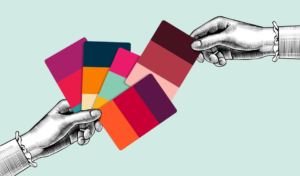 By bold and clean colours, we do not mean neon colours that were popular in the past few years. We are talking about vibrant and enchanting colours like bright blue, parrot green, tomato red and egg-yolk yellow. These colours stand out among the rest on social media, and are hard to ignore!
In 2020, we see gradient blends essentially replaced with full, bright canvases. However, refrain from using too many bright colours at once, as that makes the design hard to understand and comprehend. Instead, use two to three vibrant colours together with a clean minimalistic design in order to create attractive contrast.
5. Continuous animation sequences
Creating catchy and easy-to-understand animations can be a steep investment in terms of both, money and time. However, if marketed correctly, animations are one of the most effective ways to make a brand stand out.
They are especially useful for businesses with products that are generally difficult to use. With the world progressing towards a more technological approach towards businesses, people prefer to watch tutorials and short clips instead of reading manuals in order to understand these complex products.
Conclusively, investing time and intellectual capital in creating animations instead of static posters or long videos is a great balance in order to keep audience of your website or social media engaged and interested.